Reworked the structure and presentation to make the platform feel credible and trustworthy.
CSSDA Special KudosCSSDA Best UXCSSDA Best UICSSDA Best InnovationCSS Winner, Nominee
UX/UI Designer & Developer
My Role
9 Weeks
Timeline
TruthWeaver
Client
Mad Muse Creative (Solo)
Studio
The Project
Overview
TruthWeaver’s website failed to build credibility with skeptical seekers exploring spiritual guidance for the first time. Generic mystical imagery, unclear navigation, and poor visual hierarchy created immediate distrust. I redesigned the information architecture and visual strategy to build trust within the critical first 3 seconds and guide users toward booking with confidence.
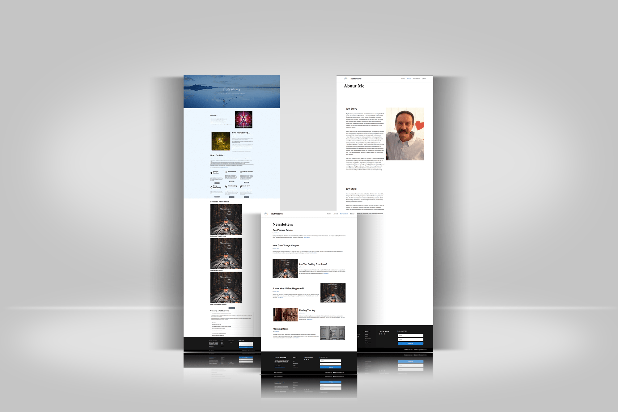
The challenge: Bruce’s website didn’t match the quality of his work. Generic mystical imagery and buried services made it nearly impossible for visitors to build trust or take action.
The Problem
What Wasn't Working
Trust was impossible to build
The site used generic mystical stock photos (glowing figures, chakra illustrations, cliche psychic icons) that made it look like every other “psychic hotline” site on the internet.
For someone already skeptical about spiritual services, this was an instant credibility killer.
Indistinguishable content
Newsletter posts section on the homepage used identical thumbnail images with “Words From My Soul” branding, making different articles visually indistinguishable.
Users couldn’t quickly scan and identify content topics.
Poor readability
Low contrast gray text failed WCAG accessibility standards, making content genuinely hard to read for stressed or anxious users.
No clear path forward
Even if visitors figured out the services, there was no obvious way to book. CTAs were unclear and navigation was confusing.
Research & Discovery
The Key Insight
The site definitly had design issues, but trust and credibility were part of the problem too. I wasn’t redesigning for people who already believe in psychic readings. I was designing for skeptics who needed every visual signal to say “this is professional and safe.”
The Process
User Journey
01
Discovery
Searching for guidance
02
First Impression
Landing on the website
03
Trust Evaluation
Looking for credibility
04
Booking Decision
Choosing whether to book
Design
Design Solutions
Information Architecture
PROBLEM
Users were pushed to book without knowing what to expect from a session.
SOLUTION
Introduced detailed service pages outlining session structure, pricing, and what clients can expect
IMPACT
Reduced uncertainty before booking and increased confidence in committing to a session
Navigation & Conversion
PROBLEM
Unclear navigation and no obvious booking path
SOLUTION
Simplified menu structure and added prominent “Book a Session” CTA
IMPACT
Clear conversion path reduced friction and decision paralysis for first time visitors
Accessibility & Trust
PROBLEM
Low contrast text failed accessibility standards
SOLUTION
Improved text contrast to meet WCAG AA standards and chose readable font sizes
IMPACT
Content became genuinely readable for stressed or anxious users during vulnerable moments
Key Design Tradeoff
While the original booking flow had fewer steps (direct from homepage to booking popup), I added an intermediate service detail page. This increased clicks to conversion but provided essential context about pricing, session structure, and what to expect, reducing post booking confusion and cancellations. I prioritized informed decisions over conversion speed.
Creative Direction
Visual Strategy
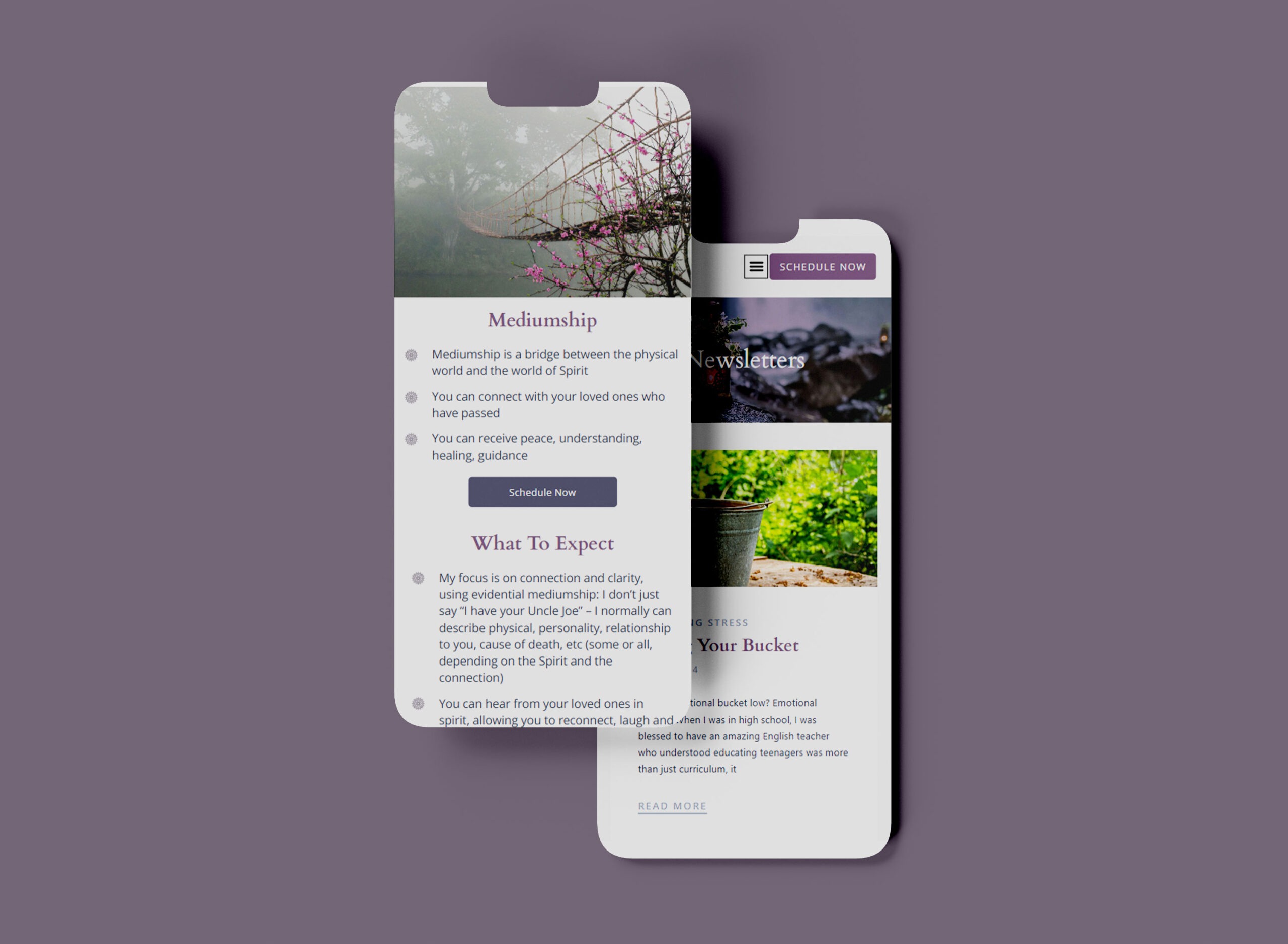
I hand-selected every image to reposition the brand from “circus tent psychic” to “grounded professional guide.” Each image was chosen to create metaphors that matched the emotional experience of the service.
Mediumship: The Cherry Blossom Bridge
For mediumship, connecting with those who’ve passed, I chose a bridge emerging from cherry blossoms into a misty forest.
The bridge represents crossing between worlds. Cherry blossoms symbolize beauty and impermanence, honoring grief without darkness. The gentle fog signals mystery without fear.
This tells the same story as the service but positions it as peaceful and grounded, not theatrical seances.
Intuitive Readings: The Crystal Ball Repositioned
How do you use a crystal ball without looking like a stereotype? I found this image where the crystal ball contains a tree, symbolizing growth and natural wisdom.
Held in human hands against a natural outdoor setting, it feels intimate and grounded, not a dark mystical parlor. The tree inside shifts the meaning from “fortune telling” to “seeing your own growth path clearly.”
This repositions the most cliched psychic symbol into something authentic.
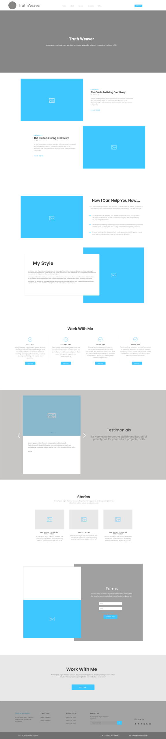
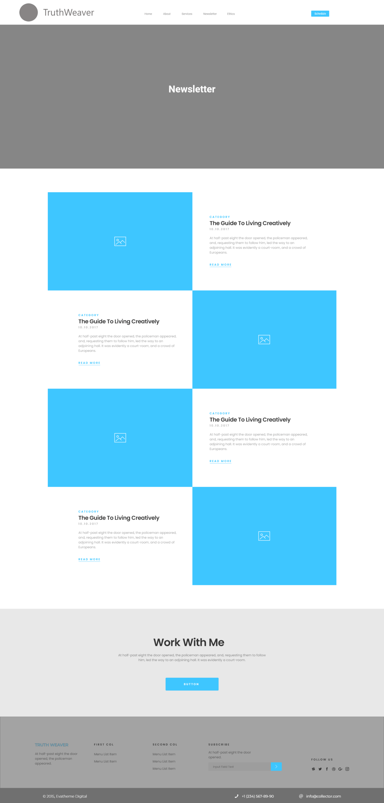
Process
Wireframes
Home Page
Service Page
Newsletter Page
The Result
The New Homepage
Outcomes
The Impact
What Changed
→ Increased consultation bookings within first month
→ Client can update content independently
→ Improved trust and professional perception
After launch, returning users noted that the new experience felt intuitive to use and peaceful and inviting, validating the shift toward clarity and grounded design.
In Bruce's Words
“Michelle is a conscientious, creative web designer who does amazing work. From the start, she listened carefully to my intentions and needs, gave me clear understanding of what she needed from me, outlined the timelines and kept me in the loop consistently, and was patient, pleasant, and professional in her work. She ensured I knew what was being delivered, worked with me to understand her vision and alignment to my goals, and ultimately delivered a stunning, professional website for me that takes me to a better place with the face of my business.”